
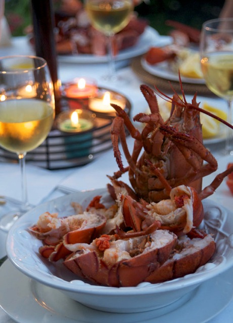
As the world turns, so does the Internet and thus this site with it, a new design of ruhlman.com by David and Joleen Hughes, of Level Design in Calistoga (I love their quill and knife graphic), implemented in WordPress by Stephen Jenkins. Thank you all. I had several goals: to keep it clean and easy to read and to navigate; to continue to feature my wife Donna's photography (the lobsters were for my 50th birthday dinner); to further solidify my partnership with Le Creuset, which makes the best enameled cast iron pots and pans on the planet; and most importantly to make the screen responsive to whatever device you're reading on. (Check it out on your smart phone or tablet—or reduce your browser window to see the screen elements shift.)
All comments are welcome. And please, do let me know of any glitches or site misbehavior you encounter so we can fix it. There are bound to be some bumps along the way.
Thanks for stopping by this site. Hope you'll keep coming back for writing, recipes, and opinion on food and cooking from this writer who believes that the world is better in countless ways when we cook our own food.
Absolutely gorgeous on Android!
Just checked it out on my phone and it is a huge improvement.
Thanks both, glad to know how it looks on other devices!
Overall, it is a fresh and light re-design. On the detail page, the photos have a nice, hairline border which I think would work well around your le Creuset sidebar as well. Right now, they float a bit. On the home page, some demarkation between the different stories would be nice... the stories are fighting each other a bit. Perhaps the same thin border around those photos as well?
And the comment text_area is tiny. No way to read more than two sentences of your reply which will make editing a comment before submission difficult.
And finally, Happy Birthday!
*susan*
Susan, you can enlarge the comment text area, at the bottom-right corner. But I agree that the default should be 5 ou 10 lines.
Will work on a fix for this, thanks for the feedback -Ruhlman web guy
text area has been expanded -web guy
Nice redesign...congrats! At some point in the future, it would be great if you had your recipes in an easy to use index...by ingredient, season, etc.. Thanks
Very tablety. Sort of like the chowhound redesign. Great for mobiles, not so great for those of us on pc/laptop.
I'm reading in Firefox, and it looks great. It's much easier to see a handful of previous posts.
Possible problem (I don't think if this is an error or by design): starting with the second post on page two of previous posts, photos are absent. There are no photos on subsequent pages. A post's photo is displayed when the post is opened.
I really like the new design... It is so light and fresh! I especially love the new knife and quill logo!
Everything looks great on my Surface, easy to navigate as well. And I agree with Nicole that the new logo is fantastic!
Love the look, and no adds!
In the mobile version no books show up but, appear when I switch to Desktop view.
Also in mobile, once I click on anything in the drop down menu ( top right corner ) I can't get back to the main site except for clicking the back button numerous times
Thanks for the feedback, I need to build a mobile friendly version of the books page.
On both versions (desktop Chrome and mobile Chrome) I tried the "Ruhlman" at the top center of any page takes you back to the main site. Though it would probably benefit from a "Home" or similar link in the drop-down menu for clarity.
You don't consider all the Creuset stuff an ad? And now a Creuset video as well?
Nice redesign! The only problem I've run into that hasn't been mentioned already is the RSS feed. It isn't loading. I even used the link at the top of the homepage to create a new "live bookmark", and it still isn't working. You aren't alone though. Nearly every site I've seen redesigned lately has problems with their RSS feed afterwards.
Hi Alex, Ruhlman's web guy here, are you using the url:
https://ruhlmancom.bigscoots-staging.com/feed
I tested that in a few RSS readers, and it seems to work fine...
Hi web guy! I just tried that url (sorry, just now getting back to you about this), and it still doesn't work. I'm using the "live bookmark" toolbar in Firefox. All my other feeds seem to be fine.
Me again. I just tried the RSS from a different computer, and it still doesn't seem to be working.
Frustratingly, the RSS feed has gone back to sending an article stub rather than the entire article so, instead of paging through the article in my RSS reader (Newsblur, FWIW), I need to open the full version of the site in a new tab.
The feed is functioning just fine in my reader.
Other than that, the site looks great and, as ever, the content is wonderfully useful and well-written.
RSS is not working for me. Using Firefox and My.Yahoo.
Like the design. Needs only a recipe index.
If you subscribe to Eat Your Books (www.eatyourbooks.com), Ruhlman's site (as well as many others, plus magazines and of course cookbooks) is indexed there.
Looks very good on both Firefox and IE running on Windows 7. On an iOS device using a Chrome, it's a nice efficient interface. A couple of comments on the iOS version:
1. The new logo doesn't appear
2 Having the number of responses to an entry appear in a circle isn't necessary.
3. The sidebar material that appears on IE or Firefox on a PC, doesn't show up on the iOS version. Therefore, your ties to LeCreuset aren't there.
Finally, please reestablish the RSS feed. Yes, it's a bit old school but it's a very handy way to have your site automatically update the my.yahoo page I use as my home page.
Update. The RSS capability is now there and seems to be working fine. Thanks.
Wow!
Looks great!
I really like it!
Mobile version looks awesome on my Nexus 7 (2013) using Chrome, especially the view individual posts. Though for some reason I'm seeing the main image for each post twice, once in a sort of full screen header that looks great and then again right below it in the "body" of the post with a border around it.
Also works well on my Galaxy S3 using Chrome, and desktop Chrome looks good as too.
I just researched past post on popcorn, android, worked great.
Past post and the comments are what I need for reference, even something as simple as popcorn. Love to read all the comments.
I have a unique geometric symbol attached to my name, very cool! Now I want a tattoo.
Thumbs up with the Ipad, os7 on the site
My symbol just went from a square to a circle. Sure glad I didn't get it tattooed on my back
Looks great Michael. Easy to read even on my iPhone.
the site looks great man, awesome upgrade!
Love the redesign! Easy to read on both my droid, I-pad and desktop!
Nice improvement!
Looks great. Some of the drop down boxes in the "tools" area are not displaying all of the text. Seems to be over left justified. Look at the bamboo scrubber as an example.
I like the look (using Chrome on a Mac) though the comment boxes are extending over on the right side, floating over the books for sale.
Looks great on iPhone - but text runs off the screen on my PC and I need to use the scroll bar on the bottom to get the full text. Otherwise - good stuff!
I am using the android system on my phone and I can see the Ruhlman banner at the top but then there is a screens worth of black and then the the first thread starts. If I switch to desktop I can see everything. Also the search magnifine glass
...magnifying glass doesnt pull up anything
Needs Donna's pictures to be larger!!
Kinda not so good actually. I will still visit but no longer a portal as the osm links fall off the page.
I actually think it's a LOT harder to read (on PC with Firefox) than before. The text being in the middle/right with the photos to the left is just really awkward and unnatural.
I have to force my eyes to look at the text to the right; the natural tendency is to look for text on the left.
Looking at it more closely, I actually hate the layout. On the main page, the text of the posts just seems to float between the photos on the left and the ad photos on the right, and the lack of anchoring doesn't sit well with me. It would be soo much more approachable if the photos were on the right, the text on the left, and some kind of vertical divider between the post area and the ads/book links.
Well done. Cleaner, and I actually find it easier to read than the old site. I too, would appreciate a search field for recipes. That logo is so unique - perhaps the beginning of a brand empire?!
I like it better on my iPhone than desktop, but I'm getting old and don't like change. I use your site as my "portal" to the links you provide. I read your columns first, then jump over to my other favorites, so as long as I can find the links easily, I'm happy.
Overall I like the design. Two quibbles: The RSS feed is not working for me, and I have to scroll side to side to get the whole site, which I find mildly annoying.
Using Firefox on a PC. The comments boxes overlap the Le Creuset and Books on the right and resizing the Firefox window does not re-position or re-size the content. I have to make my Firefox window wider than normal to see all the content.
I am viewing with Firefox on a MacBook. I have yet to see the new logo, and I get no ads that others have reported seeing along the right side. Only ad I've seen is the Le Creuset one, and it's horizontal underneath the text and picture.
Am also on Firefox and on Mac OSX 10.9.2. Also cannot see the new logo, ads, or the links people use. The comments section is wider than it used to be, so I'm mousing around to read them. Seems like there are some issues to work out! The new design is attractive. Can't wait to see the rest of it. Thanks.
It is truly a sunny kitchen
Looks fine on my iPhone 5, in both landscape and portrait orientations. As noted above, the new logo isn't visible (but it's the icon for the updated Ratio app).
Love love love the new look. Always admire the writing and topics. God bless to have removed the obnoxious ads. I don't mind the Le Creuset info, mostly informative and a feller has to eat...
It no longer fits on a page of my laptop, using Chrome. The width exceeds the screen even when I use an uncomfortably small font.
Love the new look on my iMac, iPad and iPhone. Not the same experiences, but all are satisfying. I would love it even more if I could print the recipe directly from the blog.
Quick notes on your linkage to the LeC web site:
1. Love your technique videos there and would love to see some more on YOUR site.
2. Love the ability to print your recipes off the LeC site. Hate that they print in a pale green on a color printer and are but a faint smudge on a laser jet.
3. The link to technique works from the computer, but fails on the iPad. The iPad link takes you to the home page of LeC but from you must use the search box to get to your videos-not too friendly.
Thank you for all you do!
page doesn't resize to fit my desktop mac using firefox. width exceeds the screen size as mentioned before
You know what would be great: a way to browse the recipes (recipe index).
Michael:
Very elegant solution.
Dana
Love it! Yet another thing you can add to your list of things "well done" a list that never includes how do we properly cook a steak.
Just checking for my Friday cocktail, need one already. Love the new design, very nice, Congrats
I clicked on the Le Creuset Watch and Learn ad, got a page not found error, as it tried to go to http://lecreuset.ca/en-ca/.
Not bad as an overall change, although the body text feels wide, particularly in recipes, when steps smack into the righthand ads.
One thing I find exceedingly annoying though; the social media 'share/save' button causes a popup to appear just by rapidly passing the mouse over it. Could you _please_ either require an actual click or at least an extended hover for that to happen?
Also a minor graphics/css glitch; the 'leave a reply' section slightly overflows across the gradient and touches the gray footer (firefox and chrome, independent of text box scaling). And a bit of space between the text box, submit button, and footer in general wouldn't hurt.
Very nice redesign.
Hello:
The redesign is great. Content is the high caliber that I would anticipate after reading so many of you books.
However the reason for my writing is to find out more about Lardo di Colonnata and the marble boxes that are used to cure it. I am fascinated with the prospect of trying develop a local version and would like any additional information that you can share..
Very clean looking site. It is great that some areas are responsive which is excellent for viewing on tablets and mobile phones. The designer should also make the header area responsive so it resizes and and simply addition of a mx width of 100% will prevent the paragraphs form being cut off when resized. Keep up your excellent content. Love it!
Apologies if someone has already mentioned this but the text legibility in articles and comments is pretty bad, especially longer articles. The font size is too small for the average reader, the line length is almost double what is comfortable and the line height is too tight. I guarantee your readers' eyes will be happier if your designer gives these things some much needed love.
We're working on it 🙂 -web guy
Hmm. The pictures in your previous design showed up nicely in the card view of my feed reader. Posts since the redesign no longer show any pics in that view. Probably not a biggie in the scheme of things, but thought I'd mention it.
Please add me to your subscription list..if there is one.