

My photo above. And below is the photo that Michael took with his iPhone because he wasn't sure I'd have time to take one.

©photo by Michael Ruhlman
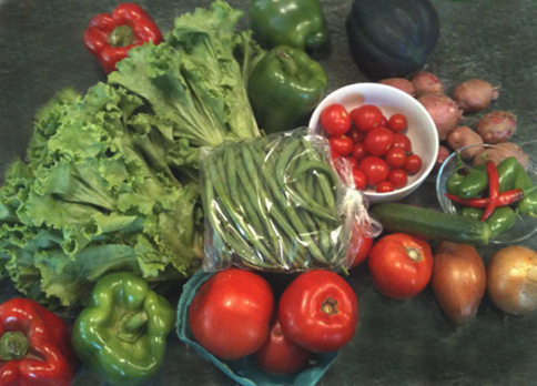
And I have to say it's not bad (he may be picking up a few photo tips like I'm getting some cooking ones from him). But—there are a few things wrong here that is basically just laziness.
To start, he could have moved the crap away and that would have given him the space on the counter, eliminating the distracting lower right corner. The other would be to take the beans out of the plastic. Anything white, silver, or shiny is going to attract the viewer's eye and plastic is simply not a good look. And speaking of white—that white bowl is doing this too. Something made of organic materials or non-shine ceramics would work better.
OK—so if this is what we had to work with—here is how I would have fixed it. It took me 10 minutes in Photoshop Elements.

OK—not great but a little cleaner. First I cropped it tighter so as to not have so much ugly counter. I then used the rubber stamp to copy the remaining counter and eliminate the crap. I did not have to change the exposure, color balance or contrast, which is impressive, Apple. I did burn in the bright glare spots and dodged the acorn squash upper right. In NONE of these photos did I increase the color saturation—really. These beauties are plenty naturally saturated on their own.
Now spend some time on that next photo. 🙂
I need to start taking some tips for my suburbanvegetablegardener site....my iphone photos show too much junk 🙂